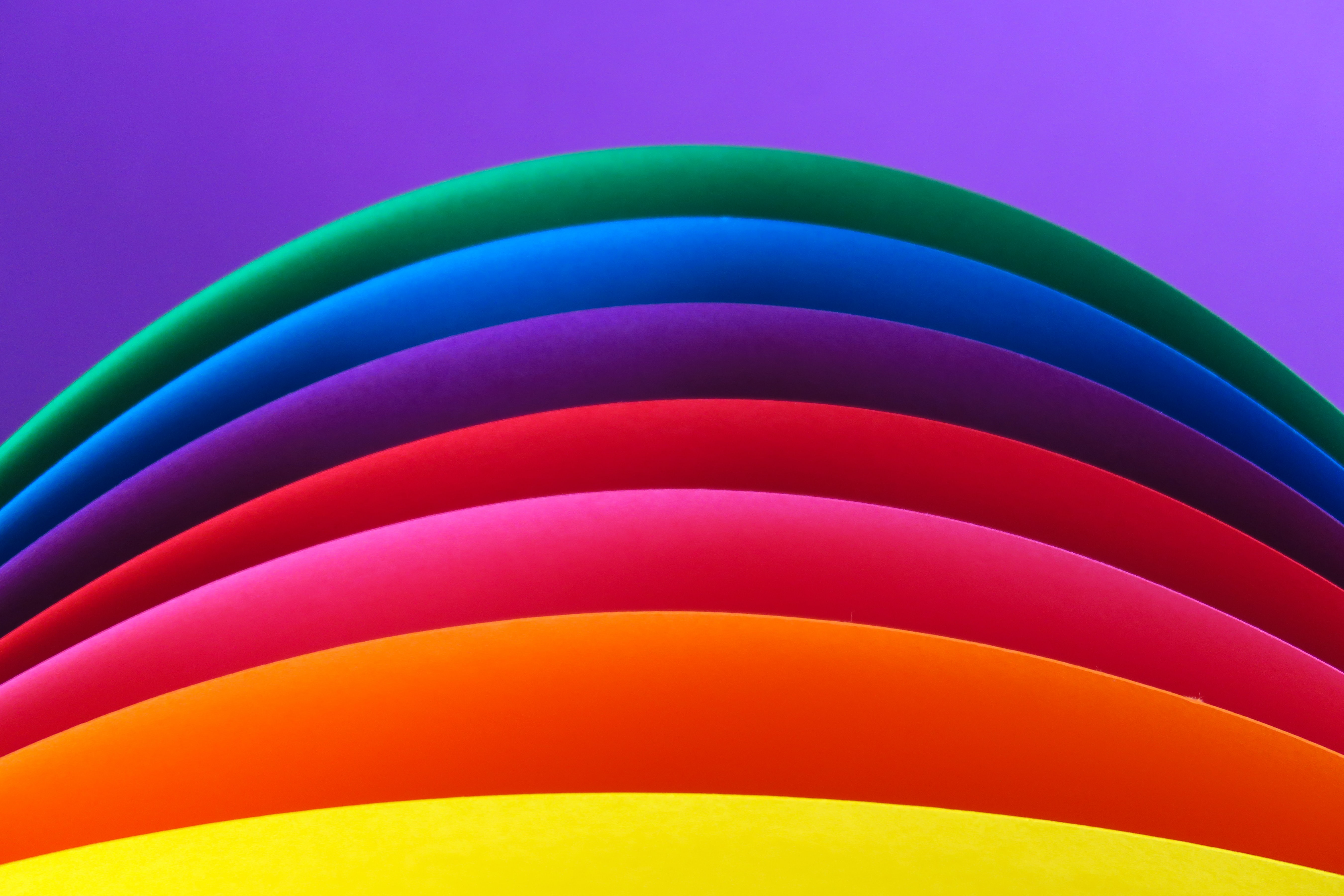
Are you looking to build a website that stands out and connects with your audience? The Power of Color Psychology in Website Design can take your site to a whole other level. Have you ever wondered why some websites are more effective than others in creating a lasting impression on users? The answer might lie in color psychology.
Color psychology is the study of how different colors can affect our emotions, thoughts, and behaviors. By understanding the psychology of color, you can use it to your advantage in creating an effective website brand that resonates with your audience.
Why Does Color Matter in Website Branding?
Color is a powerful tool in website branding as it can evoke specific emotions and create associations with your brand. For example, green is often associated with nature, growth, and freshness, making it a popular color choice for eco-friendly and health-related businesses. On the other hand, red is often associated with passion, excitement, and urgency, making it a popular choice for businesses in the food and retail industries.
Colors can also impact user experience by influencing how users perceive your website’s usability, credibility, and overall aesthetic appeal. Using too many bright and bold colors can be overwhelming and distracting, while using a limited color palette can make your website appear dull and uninteresting.
How Does Color Psychology Work?
Color psychology is based on the science of how colors affect our emotions and behaviors. Different colors can trigger different emotions and associations, such as warmth, coolness, calmness, excitement, trust, and danger. For example, blue is often associated with trust and reliability, which is why it is a popular color choice for financial institutions. Purple is often associated with luxury, sophistication, and creativity, making it a popular choice for high-end brands in the beauty, fashion, and technology industries.
When using color in website branding, it’s essential to consider the context of your brand and audience. Different cultures and contexts may have different associations with certain colors. For example, while red is associated with passion and excitement in Western cultures, it is often associated with luck and prosperity in Eastern cultures.
Examples of Effective Color Psychology in Website Branding
Let’s take a look at some real-life examples of companies that have effectively used color psychology in their website branding:
- Coca-Cola: Coca-Cola’s iconic red and white color scheme evokes feelings of happiness, excitement, and nostalgia. The use of red also creates a sense of urgency and stimulates appetite, making it a perfect color choice for a soft drink brand.
- Apple: Apple’s minimalist and sleek design aesthetic is reflected in its use of a limited color palette of black, white, and silver. The use of these neutral colors creates a sense of sophistication and simplicity that aligns with Apple’s
brand values. - Airbnb: Airbnb’s use of a bright and friendly color palette of pink, blue, and green evokes feelings of warmth, comfort, and adventure. The use of these colors creates a sense of community and openness that aligns with Airbnb’s
brand values.
Tips for Using Color Psychology in Website Branding
Here are some tips for using color psychology to create an effective website brand:
- Consider your brand personality and values. What emotions and associations do you want your brand to evoke? Choose colors that align with your brand’s personality and values.
- Use color strategically to create contrast and hierarchy. Use contrasting colors for call-to-action buttons and headings to make them stand out.
- Use a limited color palette to create consistency and simplicity. Choose a primary color and a few complementary colors that work well together and use them consistently throughout your website.
- Consider the context of your brand and audience. Different cultures and contexts may have different associations with certain colors.
- Test different color combinations to see what works best for your audience. Use A/B testing to compare different color combinations and see which ones perform better.
The Science Behind Color Psychology
Color psychology is not just a subjective matter; it’s based on the science of how colors affect our physiology. Research has shown that different colors can trigger different physiological responses in the body, such as changes in heart rate, blood pressure, and brain activity. For example, blue is often associated with feelings of calmness and relaxation, while red is associated with feelings of excitement and urgency.
How to Choose the Right Colors for Your Website
Choosing the right colors for your website can be a challenging task, but it doesn’t have to be. Here are some tips to help you choose the right colors for your website:
- Consider your brand personality and values. What emotions and associations do you want your brand to evoke?
- Consider your audience. What colors will resonate with your target audience?
- Use color theory to guide your color choices. For example, complementary colors can create a sense of contrast and balance, while analogous colors can create a sense of harmony and unity.
- Use tools like color palette generators to help you choose complementary colors that work well together.
- Test different color combinations to see what works best for your audience.
The Dos and Don’ts of Using Color in Website Branding
While color can be a powerful tool in website branding, it’s essential to use it strategically and avoid common pitfalls. Here are some dos and don’ts of using color in website branding:
Dos:
- Do choose colors that align with your brand personality and values.
- Do use color to create contrast and hierarchy.
- Do use a limited color palette to create consistency and simplicity.
- Do consider the context of your brand and audience.
- Do test different color combinations to see what works best for your audience.
Don’ts:
- Don’t use too many bright and bold colors that can be overwhelming and distracting.
- Don’t use colors that clash or create a sense of chaos.
- Don’t use too many different fonts or font sizes that can create a sense of inconsistency.
- Don’t ignore the accessibility of your website by using colors that are difficult to read or distinguish for people with visual impairments.
- Don’t be afraid to experiment with different color combinations, but always keep your brand values and audience
in mind.
In conclusion, color psychology is a crucial aspect of website branding and user experience. By understanding the psychology of color, you can create an effective website brand that resonates with your audience and helps you stand out from the competition. Remember to choose colors that align with your brand’s personality and values, use color strategically, and test different color combinations to see what works best for your audience. With the power of color psychology, you can create a website that not only looks great but also connects with your audience on a deeper level. Contact us for more information on how we can help you with the color psychology of your website.


